You’ve just gotten home from a show and your memory cards are full of epic images just waiting to be shared with the world. All that stands between you and that happy moment is the editing process.
Organizing, editing, and exporting concert photography photos is one of those things that some people love and others can’t stand at all. Whether you’re new to editing or a seasoned pro, this guide will cover a complete concert photography editing workflow to speed up your edits and unlock new creative options. In this post, I’ll be walking through a Lightroom workflow, but you can adapt these steps for the editing tool of your choice.
Let’s get started!
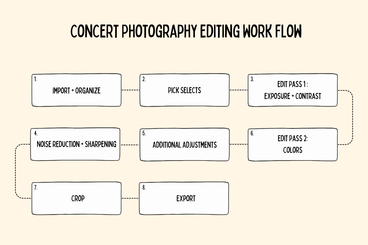
Organizing Your Images
Before you get into the edits it’s important to get your setup right. Organizing and properly storing your images only takes a few minutes and is invaluable down the line. As you build your portfolio and client list you will frequently need to dive into your catalog of images to find old photo and re-export new sizes. You can make life much easier for future you with a few simple steps. Plus, there are few worse feelings than opening a Lightroom Catalog and seeing that little “!” pop-up next to a photo—indicating a missing file. A few actions here will prevent that nightmare scenario from happening to you.
To get started, I recommend offloading your images the same night as the show to an external hard drive. Memory cards are tiny and far too easy to lose or accidentally overwrite so it’s best to get your photos off of the card and onto a drive as quickly as possible. I’m a fan of the these Seagate Portable 4TB drives available for $99 on Amazon, but there are plenty of good options out there. Aim for 2 terabytes or higher since the cost per terabyte drops with larger sized drives, and you want to make sure you have plenty of space for all your images. If you have the budget, an even better pratice is to create a secnd backup of your photos on a second external drive. I also label all of my drives with a sticker on the outside so they’re easy to find later.
The way you organize your hard drive is a mater of personal preference, but in general I recommend this setup:
- A folder for each show
- Sub-folders
- The Lightroom Catalog (or other Catalog if you use a different software)
- Raw Files
- Edited Files
Whichever structure you pick try to stick to it so you can easily find your raw files, JPGs, and Catalogs.
To help with your organization it’s also a good idea to pick a naming convention.
For example: Month.Date.Year_Aritst_Venue_City. In practice, this looks like 10.7.2024_Phoenix_House_of_Blues_Boston. Each part of the name is a key-word that will help you find photos by artist, city, or venue in the future.
Once your folders and catalog are ready you can start importing your images into your newly created Raw Files folder. In this step, you can also sort your images into Collections by artist or content. For example, if you have a shoot day with a portrait session, back stage/lifestyle shots, an opening act, and a headliner you may want to create Collections for each of these categories inside of your photo editor for faster navigation within the catalog.
Picking Selects
Once your images are imported you first need to pick out your selects. There are many ways to do this with Star Ratings, the Quick Collection, or Color Labels, but—just like with the file naming system—I recommend picking a method and sticking to it.
The method I use has two steps:
- A first pass in the Grid view giving 1-star ratings to any images that seem interesting or worth a closer look. You can do this quickly by pressing the “1” on your keyboard as a hotkey.
- On the second pass, I filter for the 1-star images and go through each of them individually—giving a 2 star rating to the ones I want to edit.
Experiment and find the method that works best for you, but I’ve found this two-step process saves time, since you can review quickly during the first pass in the grid view, and makes it easier to jump back into an old catalog to find additional images.
From here, you can use additional filters like Color Labels or additional star ratings to further organize your catalog. For example, you may want to use Color Labels to mark photos as over or under-exposed which will help in the next step: the first editing pass.
First Editing Pass
Once you have your selects picked out it’s time to start moving some sliders around and actually editing these photos!
Just like with the selection process, I’ve found a two-step editing system best balances speed and control over the final results. You can also switch this around and do the first editing pass before picking selects. This can be helpful if most of your images are over or under-exposed since you’ll have a better feel for what the final photos will look like after the exposure has been adjusted.
Your first editing pass will be all about lighting and contrast. Concerts have some of the most challenging lighting conditions you can encounter, so this first step is critical for music photographers. Within your selects, you may find some photos are too bright or too dark. Before you do anything else you need to get the exposure adjusted on these photos. We’ll be focused on two panels to do this:
- The main Tone controls
- The luminosity Tone Curve
If you used Color Labels to categorize the unedited images by exposure you can quickly filter these photos and use the Exposure slider to bring the brightness back into balance. Make sure you adjust the Exposure before moving on or it will be difficult to dial in any of the other settings.
From there, you can either adjust the brightness and contrast manually or start with a preset, like the free Photographer Tonight Base Edit—which only adjusts these basic settings without heavily impacting the colors in the image.
If you’re starting from scratch, it’s helpful to start with the the Shadow and Highlight sliders to bring back detail in your image, then adjust the Contrast, Whites, and Blacks to add in or remove contrast. Keep making adjustments, switching between these sliders, until you’re satisfied with the brightness, contrast, and detail visibility in your image.
This is also a good point to adjust the Luminosity Tone Curve. This panel can be intimidating at first, but it’s a very powerful tool for creating unique looks for your photos. My personal preference is to lift the Darks and drop down the Shadows to recover detail and add overall brightness while maintaining contrast.
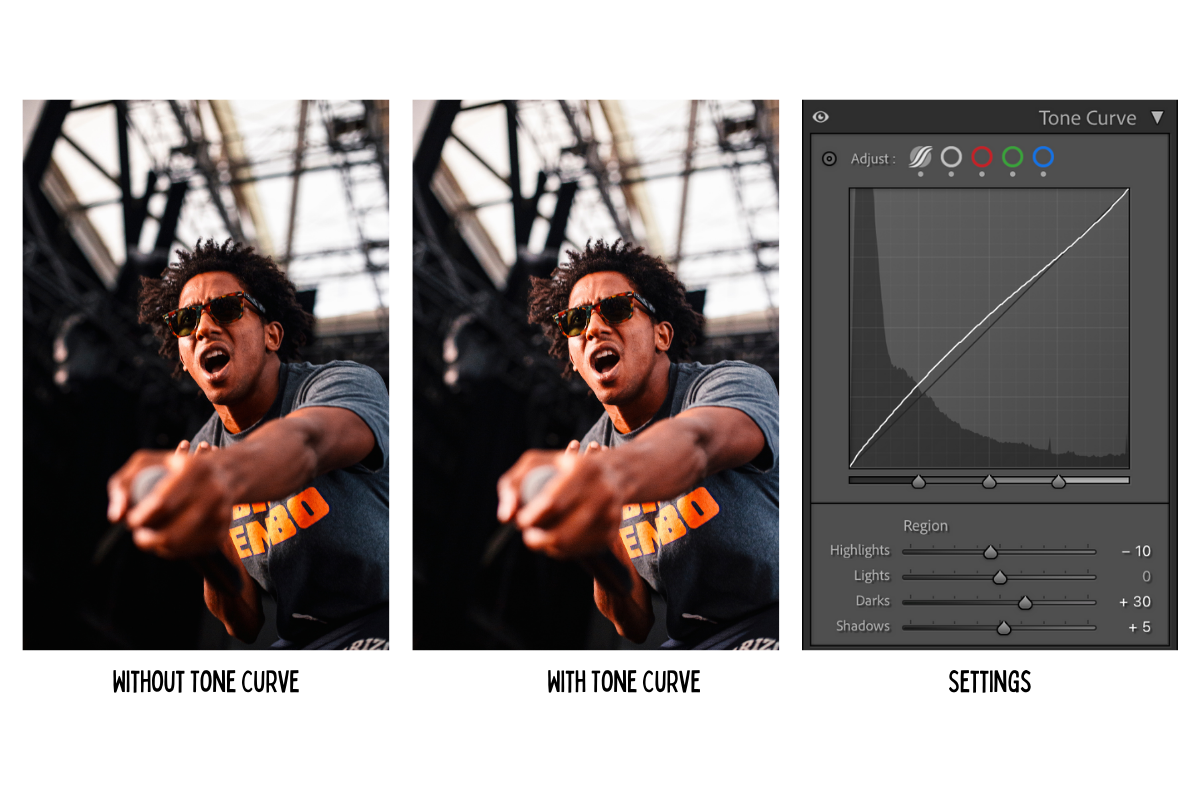
To quickly check the contrast of your image, press “V” to toggle between Black and White and Color. The Black and White view accentuates the photos’ contrast so you can more easily get a read on whether it’s too little, too much, or just right.
Second Editing Pass
Once the exposure and contrast are dialed you can start focusing on the colors. Here, you can either apply a preset that impacts the colors without changing other parts of the photo (like the 10 options here), or edit these settings from individually. There are six main tools in Lightroom to edit the colors of your image:
- Temperature and Tint
- Saturation and Vibrance
- Color Tone Curves
- The Color Mixer
- Color Grading
- Calibration
Just like with the other edits, I find it’s best to begin with the most sensitive adjustments and then hone in on the final look. The Temperature and Tint controls will have the biggest impact on your photo and this is usually where I start my color adjustments.
There are near infinite possibilities when it comes to color, so to make things simpler you can break down the initial color adjustments into three looks:
- Neutral
- Warm
- Cool

Try moving the Temperature and Tint sliders around from cool to neutral to warm to see which look you like best for your image. This will make the subsequent adjustments easier and avoid edits in different panels fighting with each other.
From here, your color edits are once again a mater of personal preference. I like to do most of my color edits in the Color Mixer—switching between the hue and saturation, then move to Color Grading and lastly Calibration for final adjustments. Others may prefer to handle the bulk of their color edits with the Tone Curve. Try out the remaining color panels for yourself to see which you prefer. In general, here’s what you can expect from each of them:
- Saturation and Vibrance: Change the overall intensity of the colors in the image. Saturation will modify the intensity of all colors, while Vibrance will impact less-saturated parts of the image.
- Color Tone Curves: This tricky but extremely effective tool allows you to adjust color levels in the highlights, shaddows, and midtones individually. Add points to create different curves and toggle between the colors to change the balance between red and teal, green and purple, and blue and yellow.
- The Color Mixer: Adjust the hue, saturation, and luminosity (brightness) of individual colors in your image. This can be a very powerful feature to change elements like stage light colors and to color correct skin tones.
- Color Grading: Similar to the Tone Curve, these color wheels allow you to edit colors in the shadows, midtones, and highlights individually. I recommend starting with the mid-tones since these usually change skin colors the most.
- Calibration: This hidden panel wayyy at the bottom of the menu can have a big effect on your photos. The Blue Primary slider was somewhat abused over the last few years to create the infamous “teal and orange” cinematic look by sliding it to the left and bringing the Red Primary slider to the right.
Once you’re satisfied with your color edits it’s a good idea to go back to your initial adjustments and readjust as needed since changing the colors and saturation can also impact exposure and contrast.
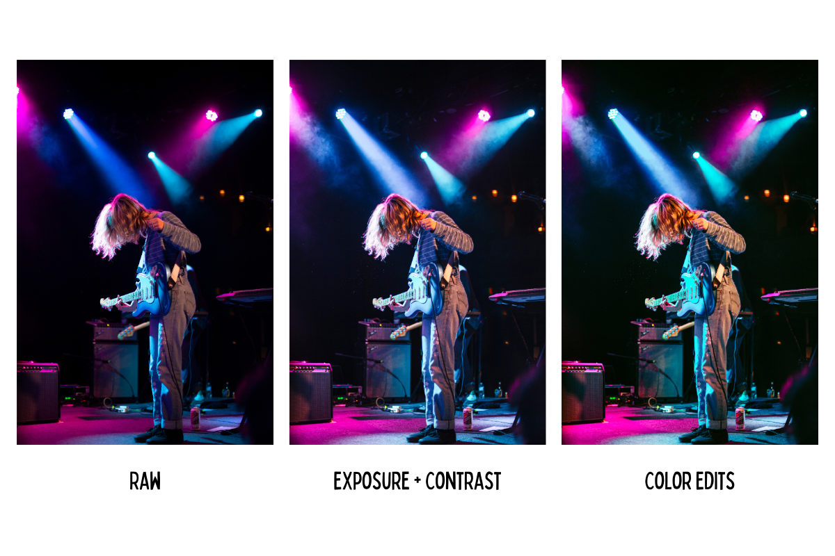
Skin Tone Tip: The Red, Orange, and Yellow sliders under the Color Mixer are excellent for restoring skin tone colors. Balance out red blotchiness by moving the Red slider to the right and reduce the saturation of the Orange and Yellow sliders to bring skin tones back into balance.
Crop + Clone Tool
A huge part of photography centers on focusing your viewer’s eyes where you want them to go. In a controlled shoot, you can change the environment to match your needs. As concert photographers though we have to work with what the stage and lighting designers give us—which often means maneuvering around stray cables, mic stands, speakers, house lights, and other potentially distracting objects.
Ideally, you can compose your photos to avoid these unwanted intrusions into your frame, but many times you have to deal with them in your edit.
In this step, we’ll focus on two kinds of edits:
- Crops and rotations
- Object removal
Like many of these editing steps, the way you crop your images is largely a mater of taste. You may prefer every line to be perfectly straight and parallel, or you could have a preference for the kind of spur-of-the-moment energy an off-angle image lends to a scene. Play around and see what feels best to you, but I also have a few general tips that can guide this part of your edit.
Experiment with empty space:
Unless you made an intentional choice to frame the artist this way, you’ll likely want to remove “empty” space from your photos. In this example, I was shooting with a fixed 50mm lens and couldn’t get any closer to the artist. The production this night also didn’t have a ton of lighting, which created large amounts of empty dark space in this photo. Since that space didn’t add anything to the way I wanted to portray the artist, I used a non-standard crop to remove the empty areas of the photo and fill the frame with details. You can also crop horizontal images into vertical formats or rotate your photos slightly for different looks.
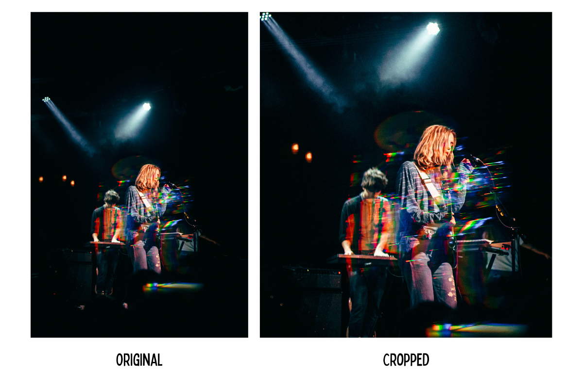
Crop out distractions:
Here’s where we go Marie Kondo on our photos. If something near the end of your frame doesn’t bring you joy you can simply crop it out. I also like to pay extra attention to the edges of the photo to remove any high contrast shapes or partial objects (like floating hands or guitar necks) that could distract from the main subject.
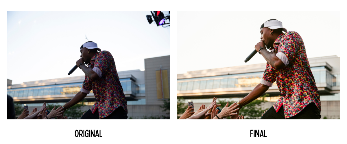
Remove remaining unwanted elements:
The orange lights in the background of this photo didn’t fit the color palette of the image so I removed them in the final edit. Lightroom makes this super easy with the Remove, Heal, Clone Stamp, and Generative AI fill options. To use these tools, press Q to open this panel and then click on the object or objects you want to remove.
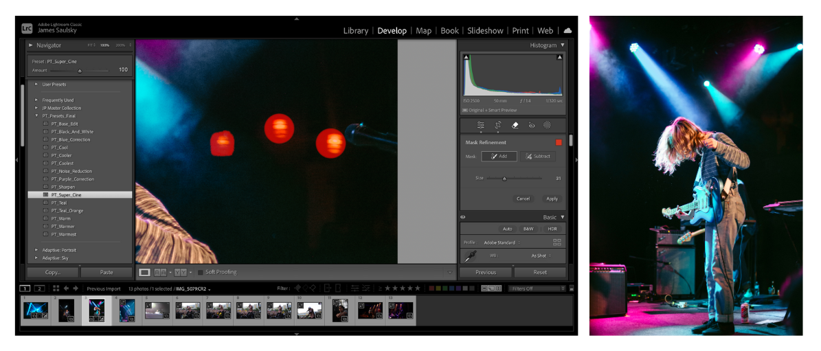
Additional Edits
At this point you’re pretty much finished, but there are a few more adjustments you may want to consider.
Sharpening and Noise Reduction
Since you’re likely shooting at higher ISOs, you may want to the Detail panel to add some noise reduction or sharpening to your images before exporting them.
With the Sharpening tool selected, drag up the amount to the right, then hold down the Option key while moving the Masking slider to see which parts of the image are being sharpened. This can help your image look crisper in the final export, but since the “soft and creamy” look is very in right now you can also skip this step.
The same goes for Denoising your photos. Newer cameras have gotten much better at managing digital noise from high ISOs, but you still may want to dial it back further. Adjust the Luminance slider to increase or decrease the amount of noise reduction, or use the new Denoise option to remove digital noise using Lightroom’s built in AI.
I recommend saving your Sharpening and Noise Reduction settings as a dedicated preset to speed things up for future edits.
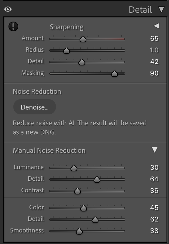
Grain
It’s trendy, it helps with the “film look”, and it adds some nice texture to your image but it’s completely an optional addition. Zoom in on your image so you can see the effect, then adjust the Amount, Size, and Roughness sliders until the grain looks the way you like.
Filters and masks
Press the “M” key to open up the Filters and Masking panel in Lightroom. From here, you can adjust specific parts of your photo to adjust and accentuate colors, focus the viewer on a subject, or restore detail. Lightroom has added some very powerful AI masking tools to speed up this process—allowing you to quickly select the primary subject or background and adjust them individually.
Advanced Edits
Concert photography is always challenging—usually in a good way! But there will be shoots where the lights are seemingly stuck on a blanketing shade of red or blue or when the stage is mostly dark, empty space. For these situations, you still have options, but will have to rely on more intensive editing techniques and your own creativity to create images you’re excited to share.
If you work at a venue frequently, I recommend creating dedicated Lightroom presets for that space to deal with some of the more difficult lighting set ups. For example, when I lived in Washington D.C. I had a special preset for U Street Music hall to restore purple or magenta images to a more natural look.
For tricky color hues, Photographer Tonight readers can also save 25% on a great color correction preset created by Holly Turner which can save you a lot of time on your edits.
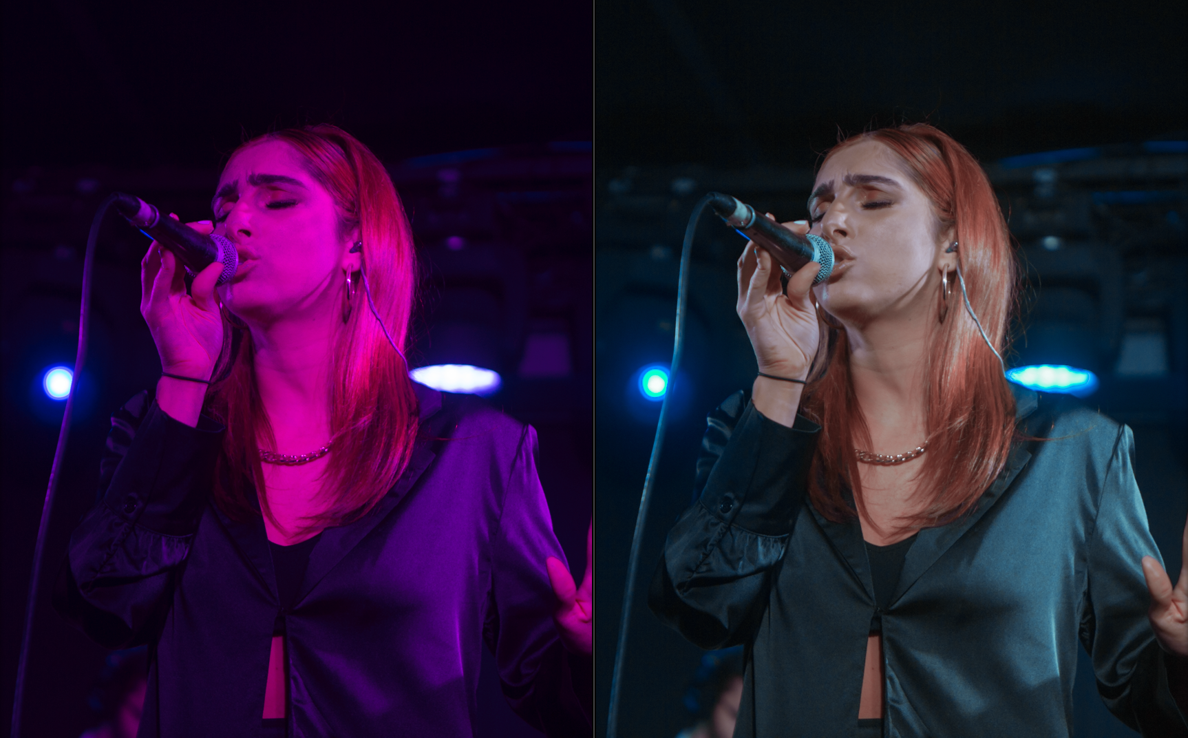
Export Settings
Once you’re satisfied with your images the last updates to make are on your Export Settings. The “best” export settings depend on where you’re sharing your images to balance image quality and file size and minimize the amount of compression platforms like Instagram impose on your photos.
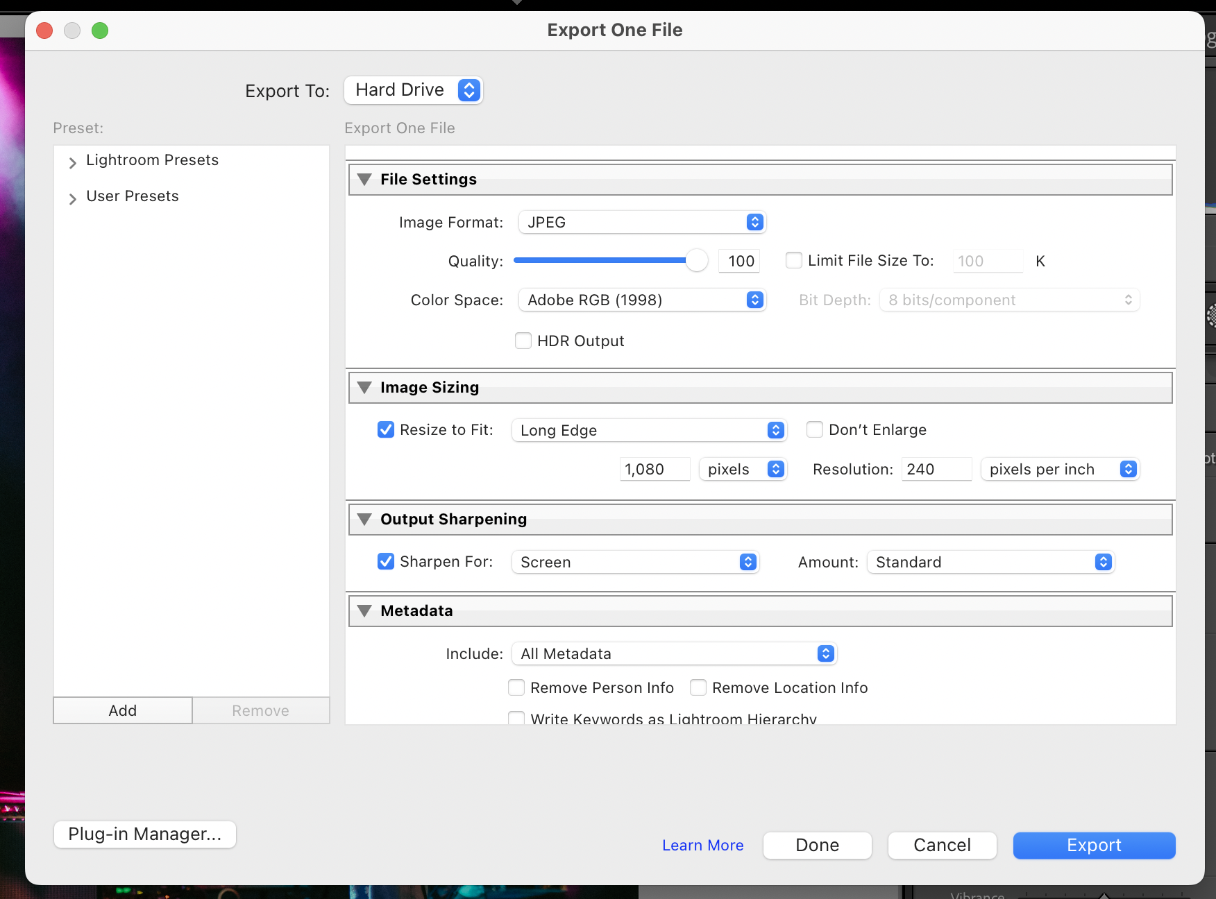
Instagram Export Settings
- File Settings: JPEG
- Quality: 80-100%
- Color Space: sRGB
- Resize Long Edge: 1080 pixels
- Resolution: 240
- Sharpen For: Screen
Web Export Settings
- File Settings: JPEG
- Quality: 80%
- Color Space: sRGB
- Resize Long Edge: 1920-2048 pixels
- Resolution: 240
- Sharpen For: Screen
In this step, it’s also a good idea to name your photos—matching the same naming convention as your overall files structure so they’re easy to find—and export them into your already set up Edited Files folder.
😅 phew, you made it. Happy editing!


.svg)
.svg)
